
Standalone Widget
The standalone widget renders a full Wirechat surface inside your own Blade layout for dashboards, account pages, and product workflows.
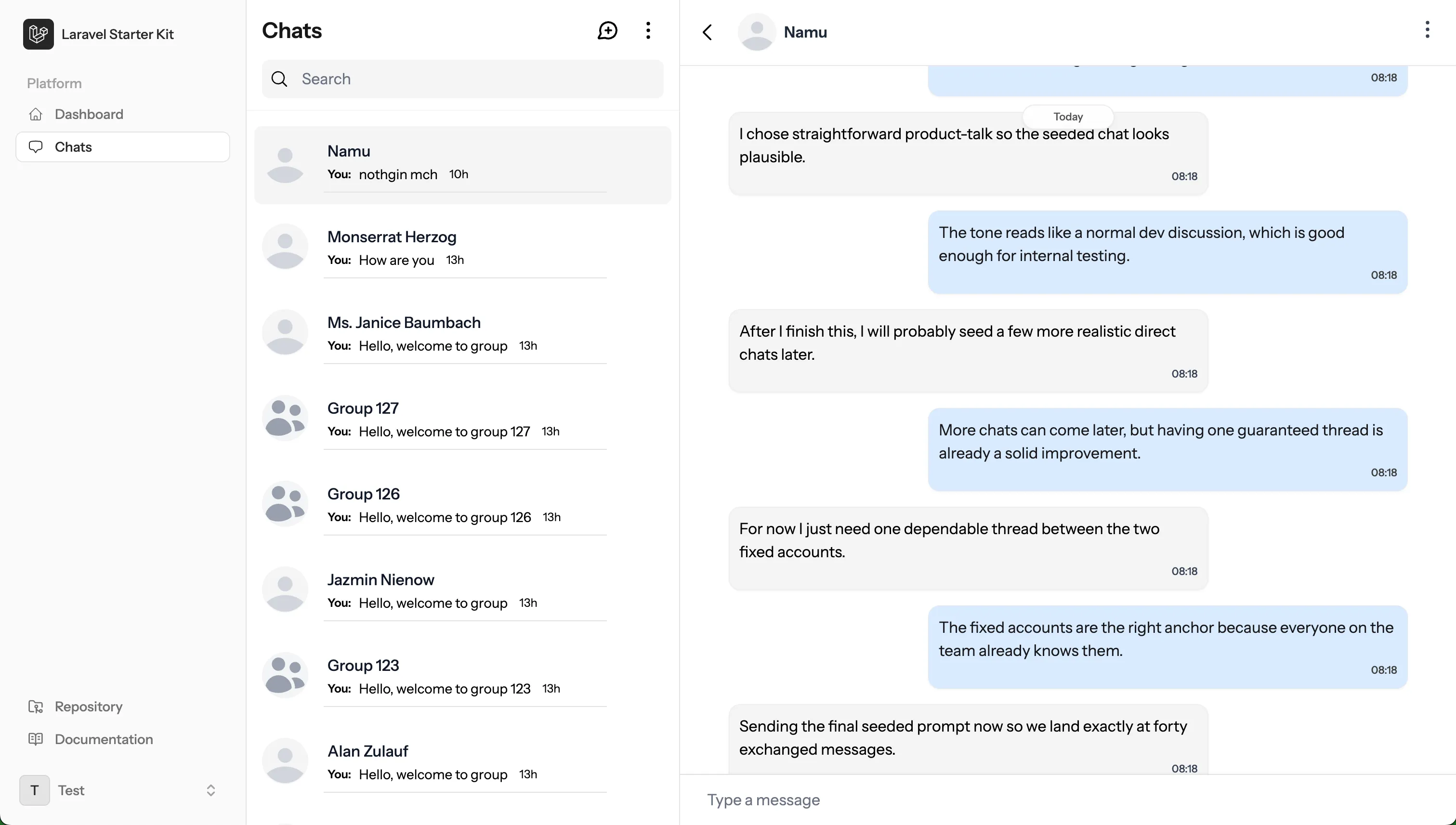
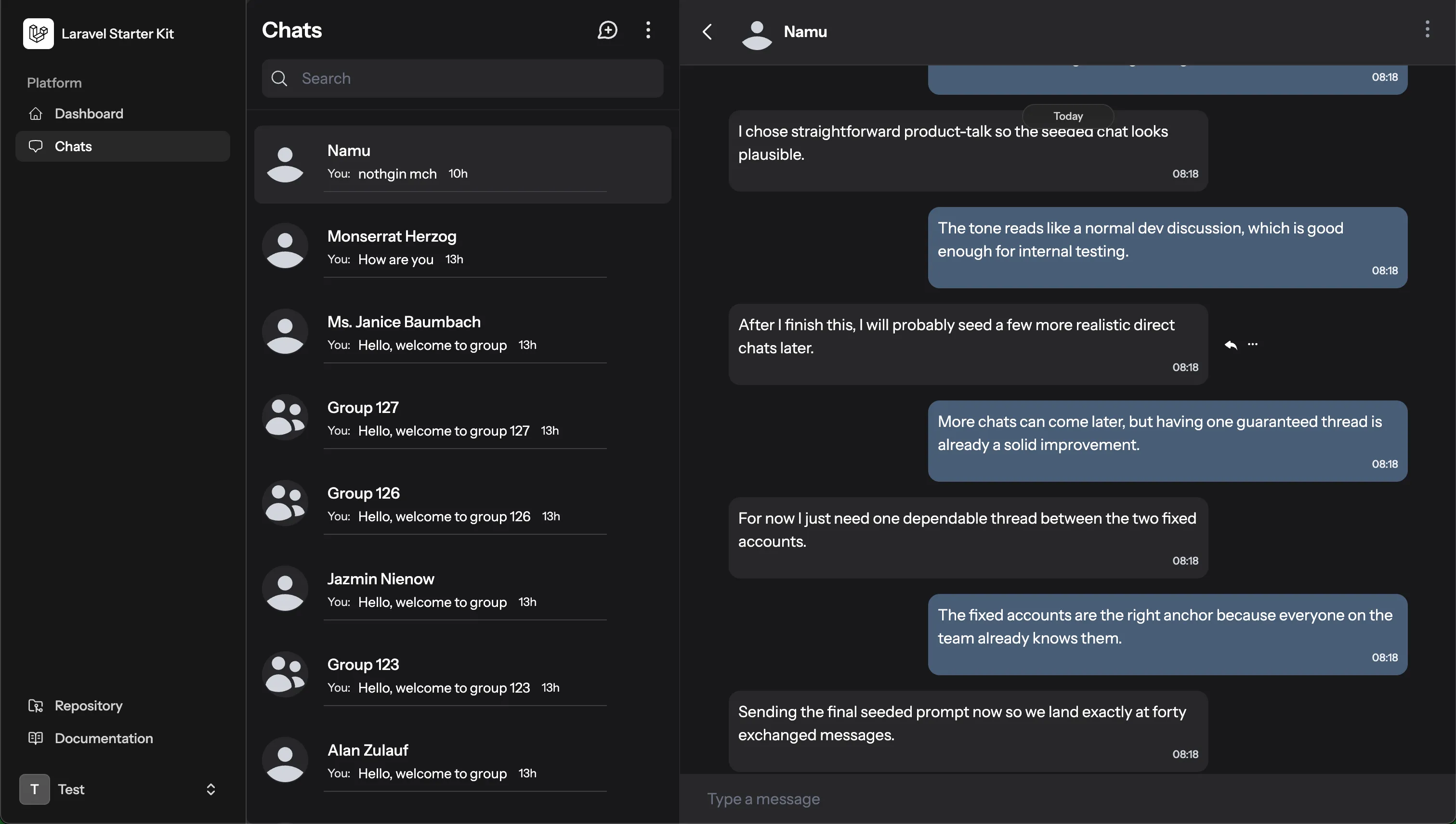
The main wirechat component combines the conversation list and active chat panel. It keeps conversation changes inside the Livewire surface, so users can move between chats without a full page reload.
Configure Panel Routes
If this widget is the main chat surface for your app, decide whether Wirechat should still register its generated full-page chat routes.
Keep generated routes enabled when users should be able to open the panel routes directly. Disable them when your own app route renders the widget:
use Wirechat\Wirechat\Panel;

public function panel(Panel $panel): Panel
{
    return $panel
        // ...
        ->registerRoutes(false);
}
Embedded chat navigation still works when generated routes are disabled. Users can open conversations inside the widget without leaving the page.
Set The Mount URL
When generated routes are disabled, set mountUrl() to the page that renders <livewire:wirechat />:
use Wirechat\Wirechat\Panel;

public function panel(Panel $panel): Panel
{
    return $panel
        // ...
        ->registerRoutes(false)
        ->mountUrl('/app/messages');
}
This gives browser hand-offs a destination when generated routes are disabled, including public invite links, notification clicks, message-request redirects, and tray expand actions. Without mountUrl(), those browser hand-offs stay disabled while embedded chat navigation continues to work inside the widget.
Prepare The Layout
Add Wirechat styles in the page head and Wirechat assets before the closing body tag:
<html>
    <head>
        @wirechatStyles
    </head>
    <body>
        {{ $slot }}

        @wirechatAssets()
    </body>
</html>
Livewire assets should already be included by your application layout or Livewire setup.
Render The Widget
Wrap the widget in a container with a fixed height. Chat lists and message panels need a stable vertical boundary so scrolling stays inside the widget.
<div class="h-[calc(100vh_-_10rem)]">
    <livewire:wirechat />
</div>
When your application has more than one Wirechat panel, pass the panel ID explicitly:
<div class="h-[calc(100vh_-_10rem)]">
    <livewire:wirechat panel="chats" />
</div>
Style The Widget Layers
Embedded Wirechat components accept scoped wrapper props. These props let you adjust the outer widget, the chats list, or the active chat panel independently.
| Prop | Applies To |
|---|---|
class |
The outer wirechat widget shell |
styles |
Inline styles for the outer wirechat widget shell |
chatsClass |
The embedded chats list inside the widget |
chatsStyles |
Inline styles for the embedded chats list |
chatClass |
The active chat panel inside the widget |
chatStyles |
Inline styles for the active chat panel |
Custom classes are appended after Wirechat's defaults, so Tailwind utility overrides work as expected:
<div class="h-[calc(100vh_-_10rem)]">
    <livewire:wirechat class="border-none rounded-none" />
</div>
Target each layer separately when the list and chat panel need different styling:
<div class="h-[calc(100vh_-_10rem)]">
    <livewire:wirechat
        class="border-none rounded-none"
        chatsClass="border-r-0"
        chatClass="border dark:bg-gray-700"
    />
</div>
Use Standalone Parts
Render the chats list on its own when a page only needs the conversation list:
<div class="h-[calc(100vh_-_10rem)]">
    <livewire:wirechat.chats />
</div>
By default, selecting a conversation sends the user to the normal Wirechat conversation route.
Pass widget="true" when the chats list should behave as part of an embedded widget flow:
<div class="h-[calc(100vh_-_10rem)]">
    <livewire:wirechat.chats widget="true" />
</div>
In widget mode, selecting a conversation dispatches an open-chat event instead of redirecting.
If generated routes are disabled, configure the panel mountUrl() so browser hand-offs can return users to the widget page.
Render a specific conversation with the standalone chat component:
<livewire:wirechat.chat
    :conversation="$conversation->id"
    class="rounded-none"
/>
The wirechat.chats and wirechat.chat components also accept class and styles for their own wrapper.
Widget Events
Widget mode uses Livewire events during conversation transitions:
| Event | Parameter | Description |
|---|---|---|
open-chat |
conversation |
Fired when a conversation is selected in wirechat.chats widget mode |
close-chat |
conversation |
Fired when a widget conversation is closed |
chat-opened |
conversation |
Fired after a widget conversation has loaded |
Use these events when your page needs to react to chat transitions around the embedded surface.
For the complete component registry and replacement guidance, see Components. For a floating Pro entry point, see Tray Widget.