
Layout
Configure Corepine Modal layouts with built-in headings, descriptions, custom slots, submit-aware forms, and manual shell composition.
Layout options include:
- built-in heading and description
- custom
headerandfooterslots - submit-aware modal forms
- full manual composition with
shell=false
Built-In Layout
If the default shell is enough, pass heading and description.
This works with both <x-corepine.modal.layout /> and standalone <x-corepine.modal />.
<x-corepine.modal.layout
    heading="Manage Users"
    description="Search and view users in your system."
>
    {{-- Content --}}
</x-corepine.modal.layout>
Custom Header And Footer
If you need your own modal chrome, provide header and footer slots.
This works on both <x-corepine.modal.layout /> and <x-corepine.modal />.
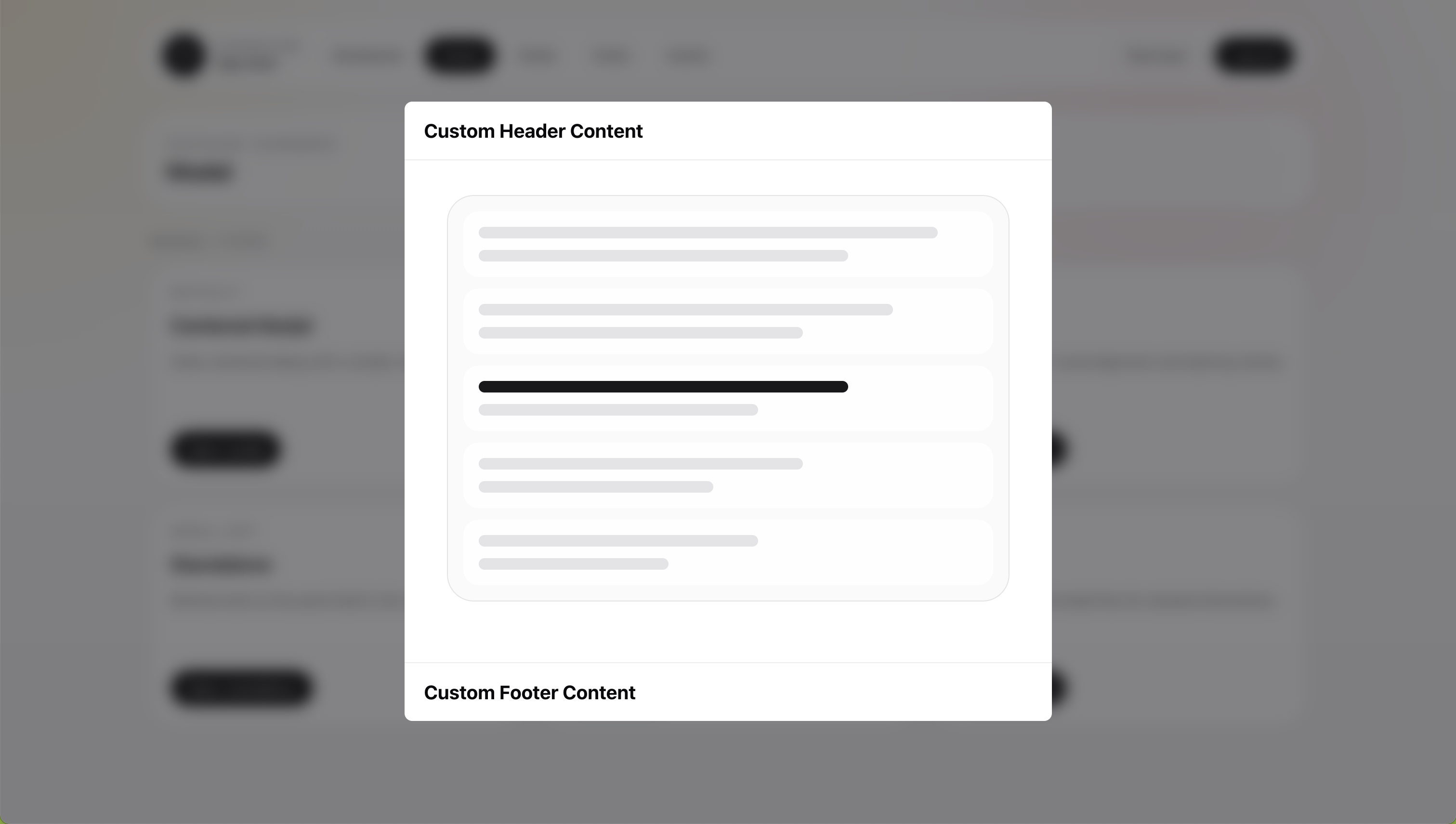
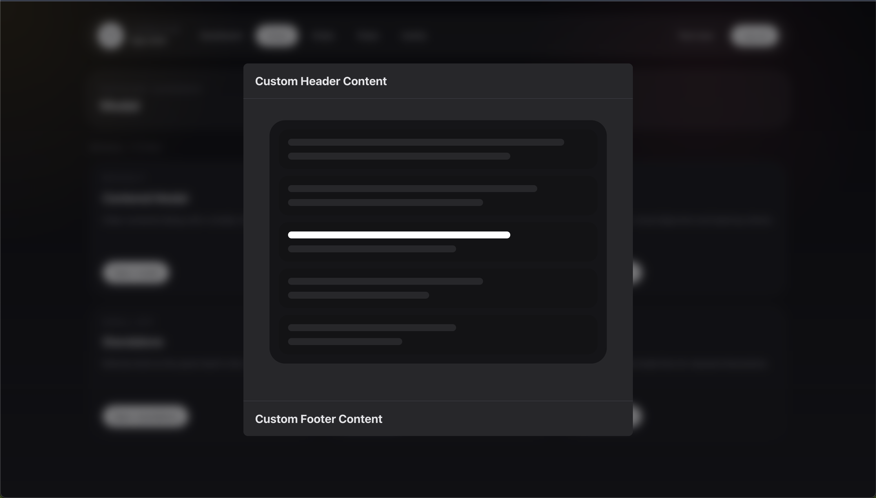
<x-corepine.modal.layout>
    <x-slot:header>
        <h2>Custom Header Content</h2>
    </x-slot:header>

    <div class="px-6 py-5">
        Content
    </div>

    <x-slot:footer>
        <button type="button">Done</button>
    </x-slot:footer>
</x-corepine.modal.layout>
When you provide a custom header slot, the built-in header props stop applying for that instance.
That means:
headingis ignoreddescriptionis ignoredshowCloseis ignored
Child Modal Header Control
In Livewire stack mode, the built-in shell detects when the active modal is a child layer.
Root modals show the normal close icon. Child modals show a chevron Back control instead, and it closes only the top layer so the user returns to the parent modal.
Child layers inherit the active parent modal's stackedBackButton value. Set it on a parent when the whole nested flow should use the same header control, then override it on a child only when that child needs different chrome.
Set stackedBackButton to false when child layers should keep the normal close icon:
public static function modalAttributes(): array
{
    return [
        'heading' => 'Edit Address',
        'stackedBackButton' => false,
    ];
}
If the child modal sets stackedBackButton itself, the child value wins over the parent value.
If you provide a custom header slot, you own that header completely and should add your own close or back control.
Submit-Aware Layouts
When submit attributes are present, the component becomes a real <form>.
This works with both <x-corepine.modal.layout /> and <x-corepine.modal />.
<x-corepine.modal.layout
    heading="Manage Users"
    description="Search and view users in your system."
    wire:submit="save"
>
    {{-- Content --}}

    <button type="submit">
        Save
    </button>
</x-corepine.modal.layout>
When submit attributes are present, the component:
- renders the outer wrapper as a form
- includes CSRF automatically for non-GET forms
- spoofs
PUT,PATCH, andDELETEmethods when needed
Because the layout becomes the form, you do not need to add another <form> inside it.
Manual Layout With shell=false
Use this when the built-in shell is too limited and you want to render the entire structure yourself.
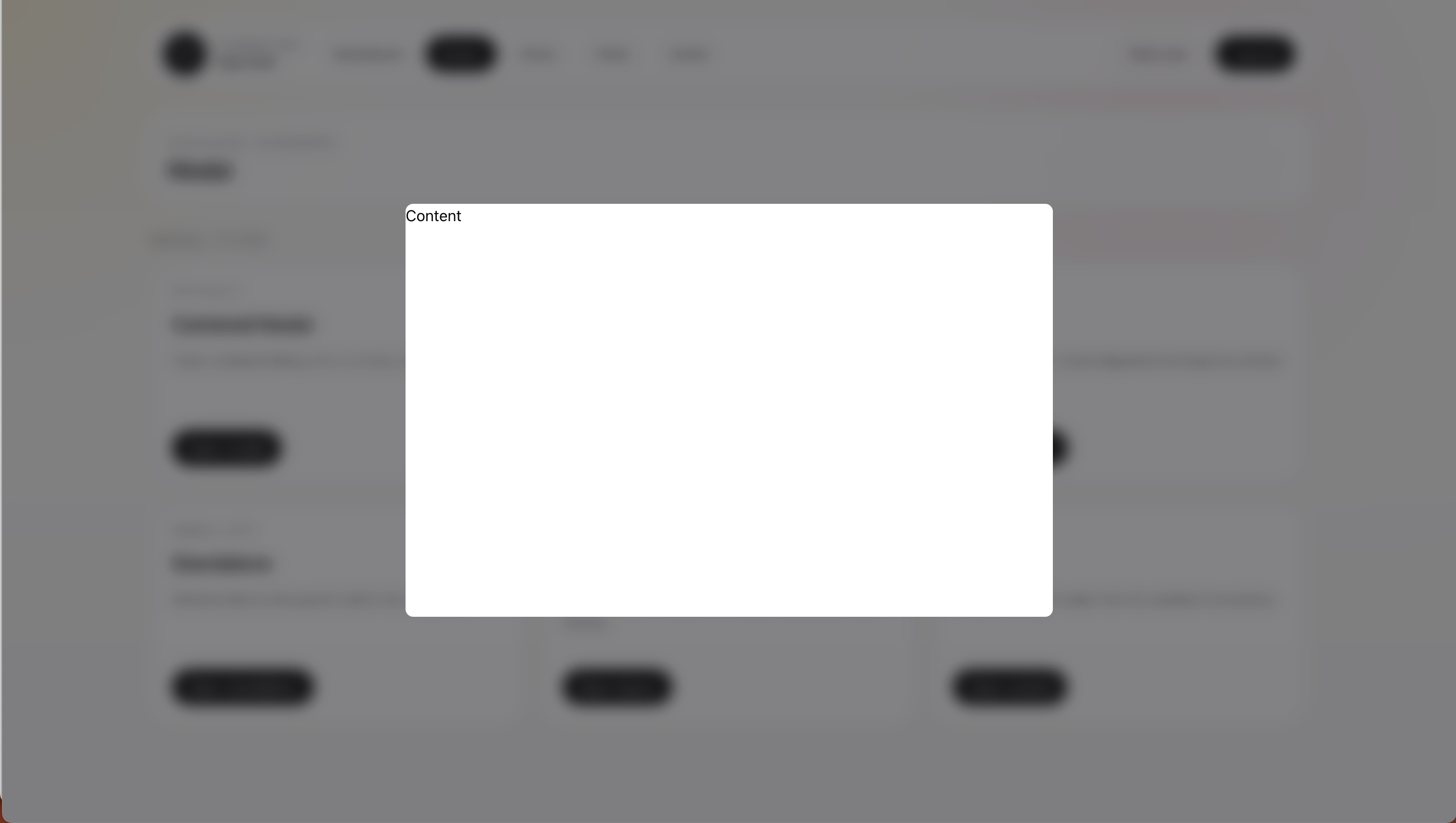
Disable the host shell in modalAttributes():
public static function modalAttributes(): array
{
    return [
        'shell' => false,
        'dismissible' => true,
        'class' => 'h-[90vh]',
        'closeOnEscape' => true,
    ];
}
Then render your own structure in the modal view:
<div>
    Content
</div>
Related
- Shared runtime options: Modal Attributes
- Component reference: Blade Components
- Button-style shell actions: Declarative Actions