Layout
Use this page for modal shell and layout concerns:
- built-in heading and description
- custom
headerandfooterslots - submit-aware modal forms
- full manual composition with
shell=false
Built-In Layout
If the default shell is enough, pass heading and description.
This works with both <x-corepine.modal.layout /> and standalone <x-corepine.modal />.
<x-corepine.modal.layout
    heading="Manage Users"
    description="Search and view users in your system."
>
    {{-- Content --}}
</x-corepine.modal.layout>
Custom Header And Footer
If you need your own modal chrome, provide header and footer slots.
This works on both <x-corepine.modal.layout /> and <x-corepine.modal />.
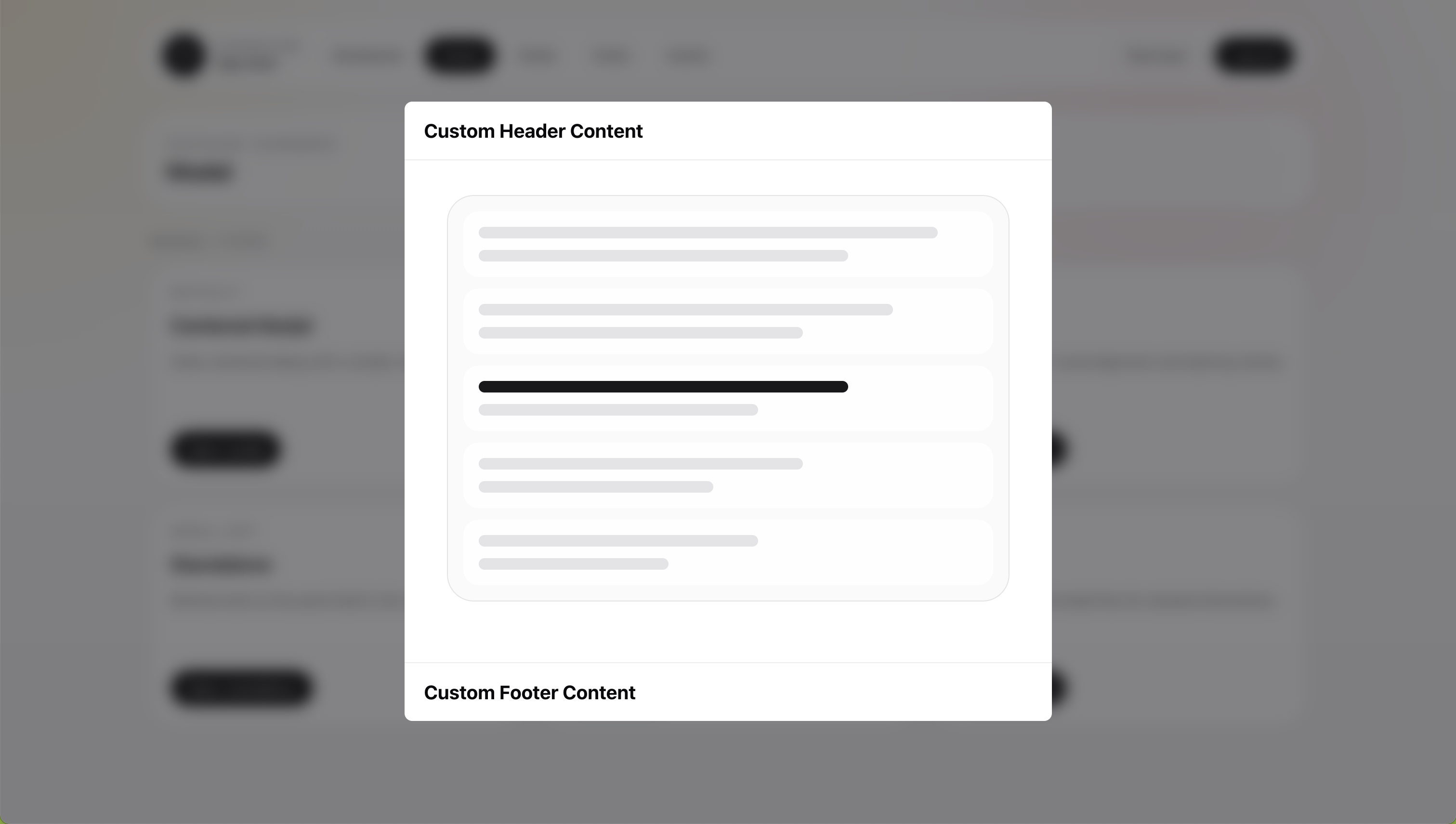
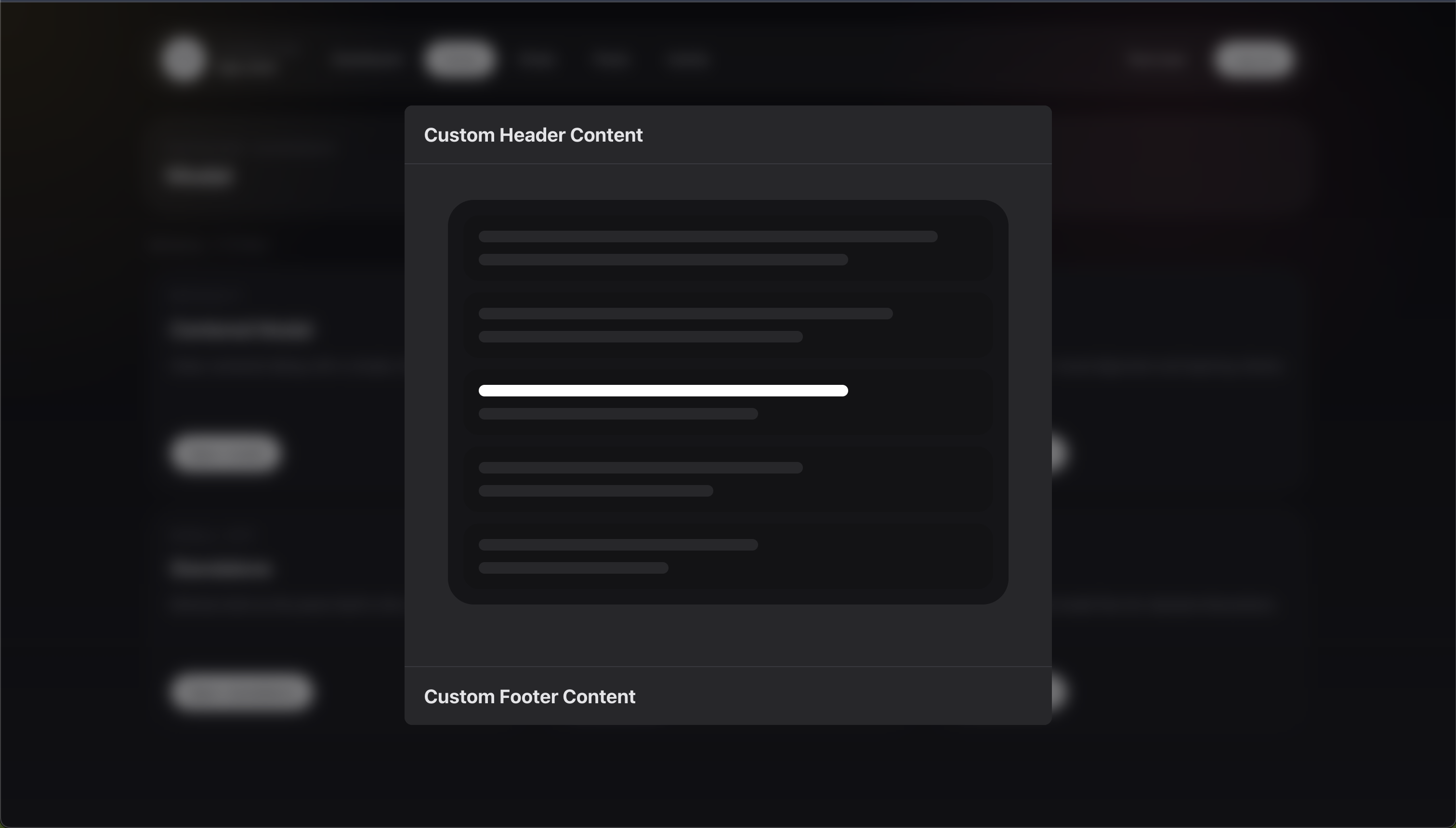
<x-corepine.modal.layout>
    <x-slot:header>
        <h2>Custom Header Content</h2>
    </x-slot:header>

    <div class="px-6 py-5">
        Content
    </div>

    <x-slot:footer>
        <button type="button">Done</button>
    </x-slot:footer>
</x-corepine.modal.layout>
When you provide a custom header slot, the built-in header props stop applying for that instance.
That means:
headingis ignoreddescriptionis ignoredshowCloseis ignored
Submit-Aware Layouts
When submit attributes are present, the component becomes a real <form>.
This works with both <x-corepine.modal.layout /> and <x-corepine.modal />.
<x-corepine.modal.layout
    heading="Manage Users"
    description="Search and view users in your system."
    wire:submit="save"
>
    {{-- Content --}}

    <button type="submit">
        Save
    </button>
</x-corepine.modal.layout>
When submit attributes are present, the component:
- renders the outer wrapper as a form
- includes CSRF automatically for non-GET forms
- spoofs
PUT,PATCH, andDELETEmethods when needed
Because the layout becomes the form, you do not need to add another <form> inside it.
Manual Layout With shell=false
Use this when the built-in shell is too limited and you want to render the entire structure yourself.
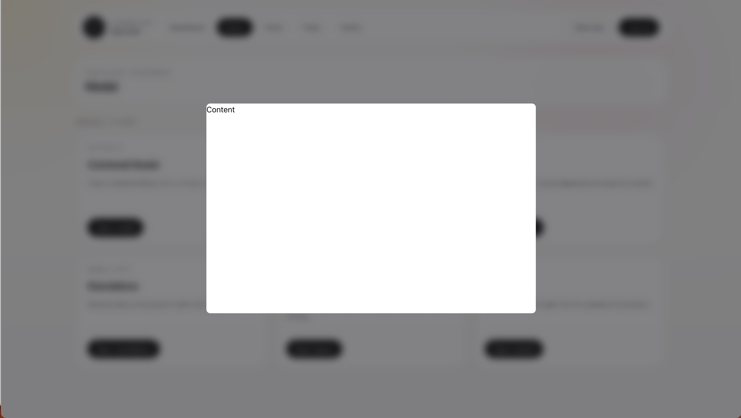
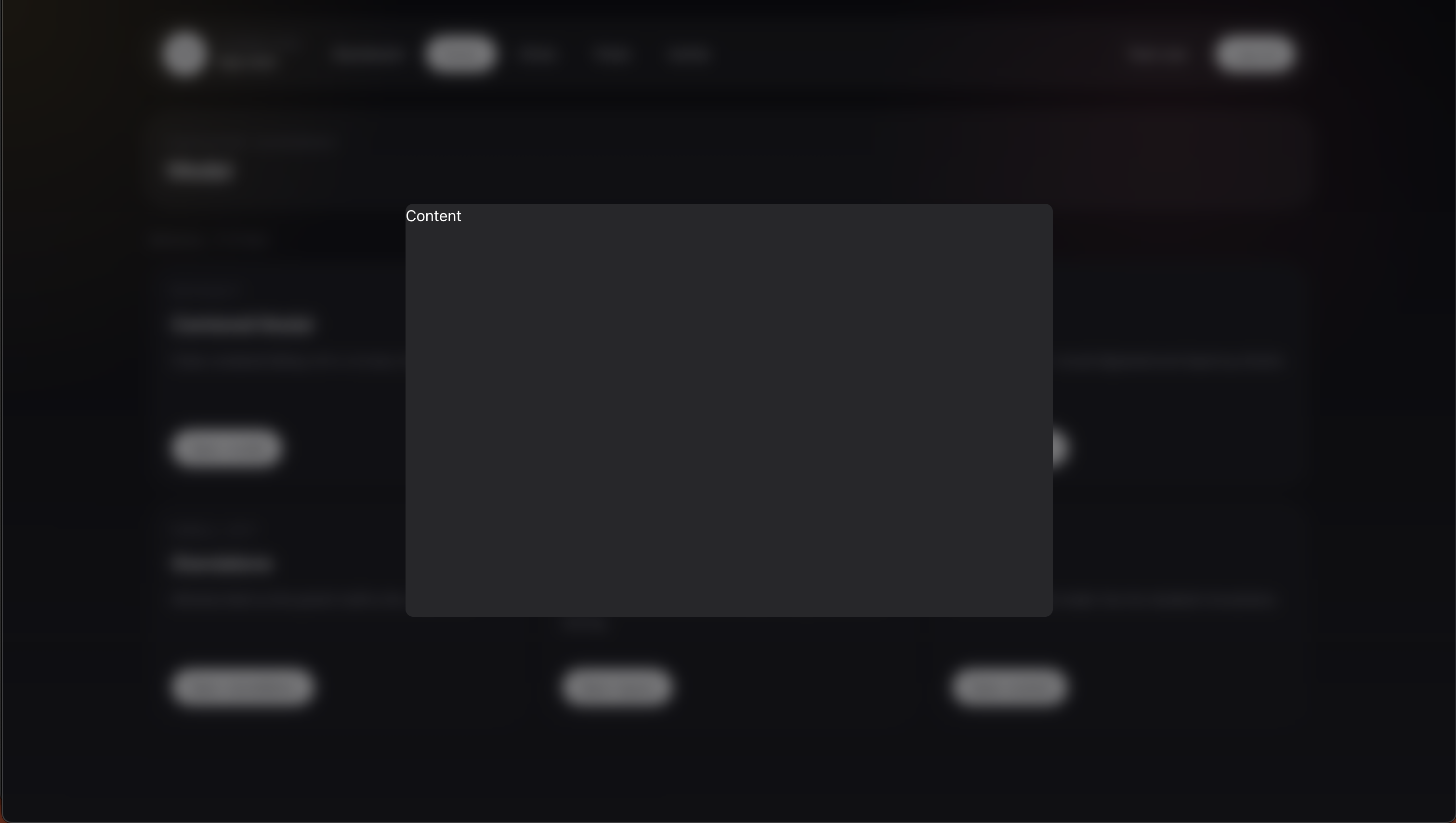
Disable the host shell in modalAttributes():
public static function modalAttributes(): array
{
    return [
        'shell' => false,
        'dismissible' => true,
        'class' => 'h-[90vh]',
        'closeOnEscape' => true,
    ];
}
Then render your own structure in the modal view:
<div>
    Content
</div>
Related
- Shared runtime options: Modal Attributes
- Component reference: Blade Components
- Button-style shell actions: Declarative Actions